
[React.js] children props를 이용해 공통 컴포넌트 분리하기
다음과 같이 여러 개의 컴포넌트가 동일한 구조를 갖는 경우에는 컴포넌트 로직을 분리할 필요가 있다.
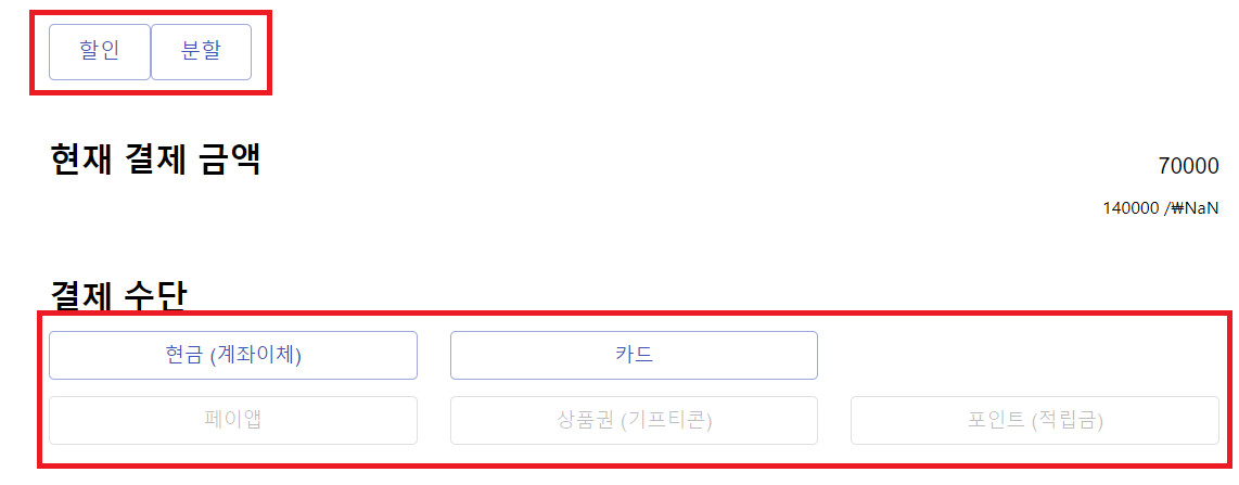
모든 컴포넌트가 Material UI 라이브러리의 dialog 컴포넌트를 공통으로 사용하며, dialog Title, Content, Action에 들어가는 버튼의 텍스트만 달라진다. 팀 선배의 도움을 받아 다음과 같은 과정으로 분리하였다. Children props의 사용이 핵심이다.
Dialog UI 컴포넌트 분리
모든 컴포넌트들이 기본적으로 가지게 될 Dialog UI 컴포넌트를 분리하였다. Material UI의 dialog 컴포넌트 스타일을 따랐으며, dialog title, width만 변경해 주었다.
작업 디렉토리 최상단에 styles 폴더를 만들고, dialog.js 파일을 만들어 DialogTitle, DialogAction, DialogContent를 export했다. 위의 일곱 개 컴포넌트들은 공통적으로 이 dialog 창을 import하여 사용하게 될 것이다.
import { withStyles } from '@material-ui/core/styles';
import MuiDialogTitle from '@material-ui/core/DialogTitle';
import MuiDialogContent from '@material-ui/core/DialogContent';
import MuiDialogActions from '@material-ui/core/DialogActions';
import IconButton from '@material-ui/core/IconButton';
import CloseIcon from '@material-ui/icons/Close';
import Typography from '@material-ui/core/Typography';

const styles = (theme) => ({
  root: {
    margin: 0,
    padding: theme.spacing(2),
    width: 500, // TODO: dialog width 절대값 수정 필요. 2021.05.13. IR
  },
  closeButton: {
    position: 'absolute',
    right: theme.spacing(1),
    top: theme.spacing(1),
    color: theme.palette.grey[500],
  },
  'dialog-title': {
    color: 'black',
    fontWeight: 'bold',
  },
});

const DialogTitle = withStyles(styles)((props) => {
  const { children, classes, onClose, ...other } = props;
  return (
    <MuiDialogTitle disableTypography className={classes.root} {...other}>
      <Typography variant="h6" className={classes['dialog-title']}>
        {children}
      </Typography>
      {onClose ? (
        <IconButton
          aria-label="close"
          className={classes.closeButton}
          onClick={onClose}
        >
          <CloseIcon />
        </IconButton>
      ) : null}
    </MuiDialogTitle>
  );
});

const DialogContent = withStyles((theme) => ({
  root: {
    padding: theme.spacing(2),
  },
}))(MuiDialogContent);

const DialogActions = withStyles((theme) => ({
  root: {
    margin: 0,
    padding: theme.spacing(1),
  },
}))(MuiDialogActions);

export { DialogTitle, DialogActions, DialogContent };
Custom Dialog로 props 분리
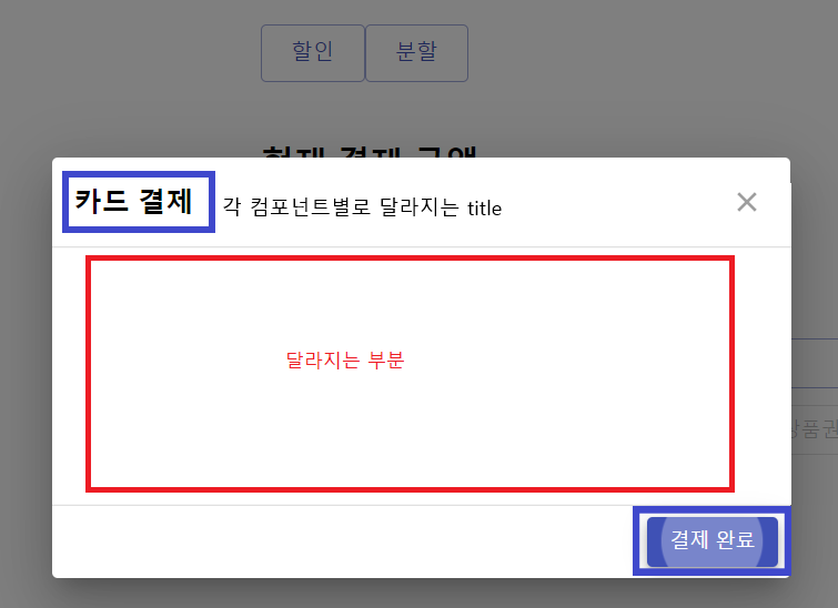
각 컴포넌트는 Index.js에서 각각의 버튼을 열 때 dialog 창이 나타나기 때문에, 버튼을 눌렀을 때 나타나는 dialog 컴포넌트를 하나로 묶어줄 수 있다. 또한 각 컴포넌트에서 사용하는 dialog마다 창을 열고 닫을 때 사용하는 함수가 모두 동일하고, dialog title만 달라진다.
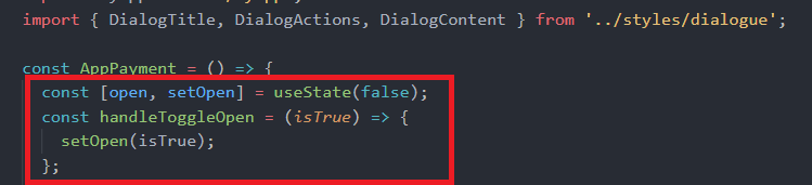
따라서 CustomDialog라는 새로운 컴포넌트를 만들고, 해당 컴포넌트가 자식 컴포넌트에게 이벤트 핸들링을 위해 관리할 open이라는 상태와 handleToggleOpen 함수, 그리고 Index.js에서 dialog 창을 열기 전에 나타날 버튼에 쓰일 text를 props로 전달할 수 있도록 했다.
자식 컴포넌트에게 props를 전달할 때는 children이라는 props를 사용하면 된다.
import React, { useState } from 'react';
import Button from '@material-ui/core/Button';
import Dialog from '@material-ui/core/Dialog';

const CustomDialog = (props) => {
  let { children, text, type } = props;

  const [open, setOpen] = useState(false);
  const handleToggleDialog = (isTrue) => () => {
    setOpen(isTrue);
  };

  return (
    <>
      <Button
        variant="outlined"
        color="primary"
        onClick={handleToggleDialog(true)}
        style=
      >
        {/* index.js에서 보일 버튼 text */}
        {text}
      </Button>
      <Dialog
        onClose={handleToggleDialog(false)}
        aria-labelledby="customized-dialog-title"
        open={open}
      >
        {/* 자식 컴포넌트에게 props 전달 */}
        {children({ setOpen, handleToggleDialog, type })}
      </Dialog>
    </>
  );
};

export default CustomDialog;
각 컴포넌트를 Custom Dialog의 자식 컴포넌트로 만들기
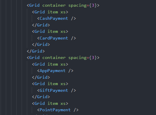
Index.js에서 반복되던 기존의 7개 컴포넌트들을 Custom Dialog의 자식 컴포넌트로 만들어 준다.
기존에는 Index.js에서는 아래와 같이 각각의 컴포넌트만 반환하면 되었고, 그 대신 각 컴포넌트의 코드에 반복되는 부분이 많았다.
이제는 Index.js에서 CustomDialog를 import하고, 그 자식 컴포넌트로 각각의 컴포넌트를 위치시킨다. 그리고 CustomDialog에서 자식 컴포넌트로 전달할 props를 convertedProps라는 props로 전달해 준다. 각각의 자식 컴포넌트에서는 convertedProps를 사용할 수 있고, CustomDialog가 convertedProps로 전달할 것은 handleOpenDialog와 text가 된다. 물론 convertedProps는 임의로 정한 이름일 뿐이다.
AppPayment의 예를 들면, Index.js에서의 에서의 <AppPayment /> 부분을 다음과 같이 바꾸면 된다.
<CustomDialog>
	<AppPayment text={'페이앱'} convertedProps={convertedProps} />
</CustomDialog>
이제 AppPayment 컴포넌트를 정의하는 AppPayment.js 파일에서는 props로 넘어 올 convertedProps를 사용하면 된다.
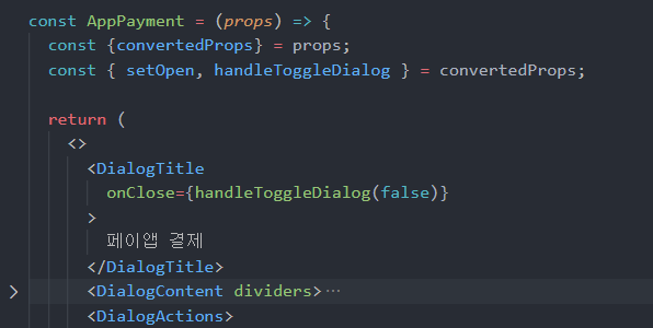
위와 같이 리액트의 children props를 이용하면 여러 컴포넌트에서 공통적으로 필요한 상태 관리, 이벤트 핸들링 등의 로직까지 분리해낼 수 있다.
공유하기
Twitter Facebook LinkedIn

댓글남기기